01
Workouts
Personalized sessions built from the user's goal, level and available time — with a clear start, middle and end.

01
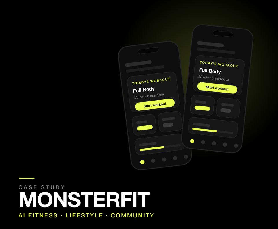
MonsterFit is an AI-powered fitness and lifestyle application concept that brings workouts, nutrition, progress tracking and community into one personalized daily journey. It is a self-initiated project: I defined the problem, shaped the product direction and designed the end-to-end mobile experience.
The premise is simple. Most people who decide to get healthier end up running a workout app, a calorie tracker, a notes document for progress and a social feed for motivation. MonsterFit collapses that stack into a single system built around one question the product must answer every day: what should I do today?
Fitness shouldn't feel like managing five different apps.
01
Personalized sessions built from the user's goal, level and available time — with a clear start, middle and end.
02
Meals presented as decisions with calories and macros attached, not as a decorative list of food photography.
03
Consistency, streaks and weekly movement shown before deep analytics, so momentum is visible early.
04
Challenges, trainers and shared accountability offered as optional depth rather than a mandatory step.
02
Starting a fitness routine is easy. Maintaining one is where people fail — and the failure usually happens before the second workout, not during it.
A beginner typically needs one application for workouts, another for nutrition, another for tracking progress, and social media for motivation. Each of those tools is competent on its own. Together they create three problems that compound.
Problem 01
Beginners are presented with dozens of workout plans, hundreds of exercises and endless recommendations — with no signal about where to start or what applies to them.
Problem 02
Workout planning, nutrition and progress tracking live in separate products, so the user becomes the integration layer between four apps.
Problem 03
Generic plans treat every user as the same person, ignoring the variables that actually determine whether a routine survives week two.
The design goal follows from that: make fitness feel personal, simple, motivating and actionable — in that order. The product should not ask the user to browse. It should answer the question they already have in their head.
What should I do today?
— The question the home screen is built to answer
03
MonsterFit is a self-initiated concept, so there was no interview pool, no survey and no analytics to inherit. Rather than dress the project up with research it never had, I worked from explicitly stated assumptions and kept them visible throughout the design.
Each assumption below shaped a design decision. Each one is also falsifiable — which is the point. Stating them clearly means a later round of usability testing can confirm or kill them instead of debating taste.
| Assumption | Why it matters | How it shaped the design |
|---|---|---|
| A1 · Beginners quit at the choice step, not the workout step | Decision fatigue happens before any exercise begins | Home leads with one pre-selected workout instead of a catalogue |
| A2 · Switching between apps breaks the habit loop | Every context switch is a chance to abandon the session | Workout, meals, progress and community share one navigation model |
| A3 · Available time varies day to day | A fixed 45-minute plan fails on a busy Tuesday | Onboarding captures time, and AI regenerates the session from it |
| A4 · Motivation decays faster than discipline | Long-term charts do not reward showing up today | Streaks and weekly consistency are surfaced above deep analytics |
| A5 · Nutrition literacy is low | A calorie number alone does not tell anyone what to eat | Meals show portion, macros and a plain-language reason |
| A6 · Accountability retains better than content | Content libraries are abundant; personal follow-through is not | Community sits one tap from the daily plan, never in front of it |
These are hypotheses, not findings. In a live project each would be validated through task-based usability testing and diary-style check-ins before the interface was finalized.
04
Personas here are design proxies rather than research artifacts: two clearly opposed mindsets that the same interface has to serve without splitting into two products. Everything contentious in the design — how much depth, how much explanation, where analytics sit — got decided by asking which of these two it serves first.
The Restarter · primary user
“I have started four times this year. I don't need more content — I need to know what to do tonight.”
The Optimizer · secondary user
“I already train. I want structure, honest progress and people who take it as seriously as I do.”
Design decision
The default experience optimizes for the beginner who needs one obvious next action. Advanced detail — sets, macros, history — is one layer down, never removed, so the intermediate user is not locked out of the product.
05
The primary journey became the spine of the product. Every screen had to justify its place in this sequence, and anything that could not was cut rather than buried.
A second, shorter flow matters just as much: the time-crunched session. Assumption A3 says availability changes daily, so the product needs a legitimate path for the night the user only has twenty minutes — without making them feel like they are doing the workout wrong.
Design decision
AI is most useful when it responds to a real limitation — time, equipment, energy. The interface therefore exposes generation at the moment of the constraint rather than hiding it behind a general-purpose assistant nobody opens.
06
Five destinations, no more. Every additional tab competes with the daily plan for attention, and the daily plan is the product.
Key structural decision
The home screen's job is to convert intention into action. It surfaces the single next action first, then progress, meals and community underneath it — so the user can leave the app having done the thing rather than having read about it.
| Screen | The question it must answer |
|---|---|
| Home | What should I do today? |
| Discover | What else could I try? |
| Workout | What exactly am I doing right now? |
| Meal plan | What should I eat, and does it fit my goal? |
| Profile | Is this actually working? |
07
Low-fidelity first, deliberately. The structural sketches below were used to settle hierarchy — order, weight and repetition — before any colour or type decision could distract the conversation.
Each frame is built on the same rule: one primary action, one dominant object, everything else subordinate.
Home — command centre
Workout — in session
Meal plan — decisions, not decoration
Design decision
I prioritized the user's next action over displaying every available metric, because beginners need clarity before depth. Metrics that do not change a decision wait until after the action.
08
Six decisions carry most of the product. Each one trades something away on purpose.
Decision 01
Every screen commits to a single primary button. Secondary options exist but never compete for the same visual weight — the trade-off is that some depth sits one tap deeper than a power user might like.
Decision 02
Onboarding asks goal, level, time, workout preference and dietary preference up front. The trade-off is four screens of friction before value — accepted because that data is what makes day one feel hand-made.
Decision 03
Instead of “here are 50 workouts”, home shows “Full Body · 32 min · Start”. The trade-off is reduced browsing, which is the point: browsing is where beginners stall.
Decision 04
Generation is triggered by time, equipment or energy — “I only have 20 minutes” — rather than an open chat box. The trade-off is a narrower feature set that is far more likely to actually be used.
Decision 05
Meals are shown with calories, protein and a plain reason, plus a route to swap. The trade-off is that food photography takes a back seat to information that changes behaviour.
Decision 06
Challenges and trainers sit one tap from the plan. The trade-off is a quieter social surface, in exchange for never blocking the daily task with a feed.
09
The visual system had to feel energetic and premium without becoming noisy. Fitness products default to gradients, photography and motivational typography; none of that helps a user find the start button at 7am.
The answer was a deliberately narrow palette: black, white and a single lime accent. Three values carry the entire interface, so contrast does the work that decoration usually does.
| Token | Value | Used for |
|---|---|---|
| Background | #000000 | Base canvas on every screen |
| Accent | #E9FF51 | Primary CTAs, progress, active states, key metrics |
| Text | #FFFFFF | Primary type |
| Muted text | #8A8A8A | Supporting labels, secondary metadata |
| Surface | #121212 | Cards and grouped content |
| Border | rgba(255,255,255,0.08) | Separation without outlines |
Design decision
The home screen is intentionally incomplete. It shows today's workout, today's goal and the streak — and withholds everything else. A dashboard that shows everything is a dashboard that decides nothing.
10
The prototype connects the screens in the order a real first week would happen. Its purpose was to check pacing and hierarchy — how long the path from opening the app to finishing a workout actually takes, and whether anything in it makes the user stop and think.
The prototype's job was to make the hierarchy reviewable, not to prove it. The next step is task-based testing with the assumptions listed in section 03.
11
The strongest outcome of the project is not a screen — it is the constraint the product holds to. Every time the design drifted towards showing more, the daily question pulled it back: does this help someone decide what to do today?
What I would change: the onboarding asks for a lot before it gives anything back. Four steps is a long cold start, and a progressive version that earns each question would likely perform better. That is the first thing I would test.
Takeaway 01
Settling order and hierarchy in low fidelity made the visual pass almost mechanical. The colour system was a small decision because the hard decisions were already made.
Takeaway 02
Writing A1–A6 removed the temptation to invent research. It also made critique easier: feedback could target an assumption instead of a preference.
Takeaway 03
Generation tied to time and equipment is a feature a user can explain to a friend. An unbounded chat assistant is not.
I designed a fitness ecosystem that turns scattered health activities into one personalized daily journey.