Building a typed, themeable component library other teams can ship on
Role
Design Systems Lead
Platform
Web · React library
Category
Open source · Design system
Project type
Self-initiated product
01
Overview
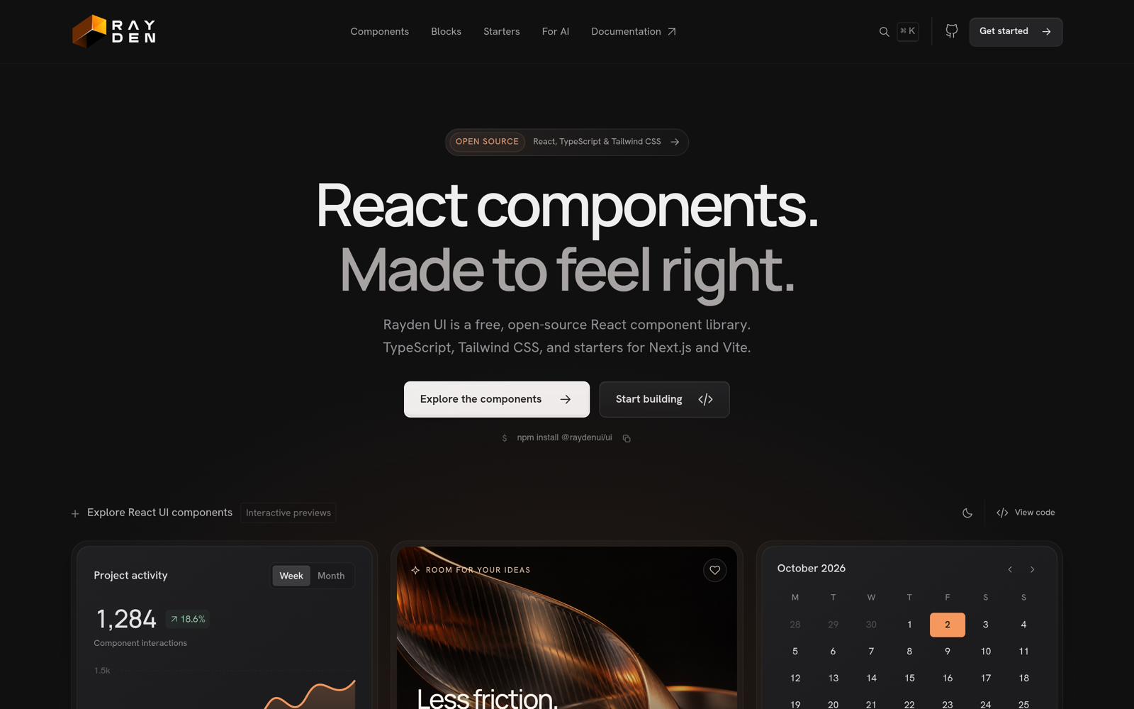
Rayden UI is a free, open-source React component library and design system under the MIT license — typed components, reusable page blocks, icons, shared design tokens, and light and dark themes, with project starters for Next.js and Vite and an AI coding companion.
Less friction. More feeling. From buttons and inputs to data tables, activity feeds, and full page blocks, every piece is designed to drop into a React 18+ app and feel like it was built for it.
One package, four starting points, and an AI companion that already speaks the system's language.
02
The Challenge
Teams lose weeks to blank-canvas setup and inconsistent UI: every project re-solves buttons, forms, theming, and dark mode, AI assistants guess at APIs, and dashboards, landing pages, and stores all start from zero. Developers needed typed, themeable pieces plus opinionated starting points — without being locked into a rigid look.
Blank-canvas tax: Every new project re-derives buttons, forms, tables, and dark mode from scratch.
Guesswork APIs: Coding assistants had no source of truth for props, variants, or composition rules.
Opinion or flexibility: Most systems offered one or the other: locked-in themes, or primitives with no taste.
03
Role, Methods & Tools
Role
Full design-system surface
Defining the component API and TypeScript props, building primitives (buttons, inputs, forms, date pickers, tables, activity feeds), page blocks in @raydenui/ui/blocks, the theming layer, documentation with live interactive previews, the create-rayden-app starters, and the @raydenui/ai MCP companion for coding assistants.
I shipped importable components with compiled CSS and TypeScript definitions, one-token theming through shared CSS variables and Tailwind v4 tokens (colors, typography, spacing, light/dark), four starters (dashboard, landing page, e-commerce, blog) via npx create-rayden-app, and a MCP server exposing component manifests, design tokens, and composition recipes so AI assistants build in the system's language.
Components
Importable primitives with compiled CSS and full TypeScript definitions — no build step required on the consuming side.
Tokens
One theme layer spanning shared CSS variables and Tailwind v4 tokens: colours, typography, spacing, and light/dark modes.
Starters
Four opinionated dashboards, landing pages, e-commerce and blog scaffolds via npx create-rayden-app.
MCP companion
An MCP server exposing component manifests, design tokens, and composition recipes to coding assistants.
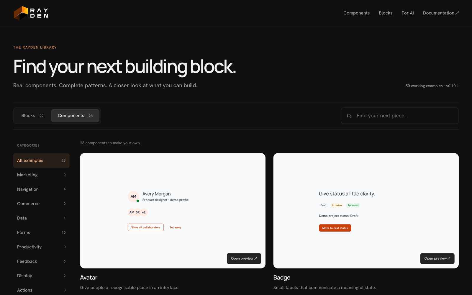
Component docs with live interactive previewsBrowse blocks and primitives in the showcase
05
In Practice
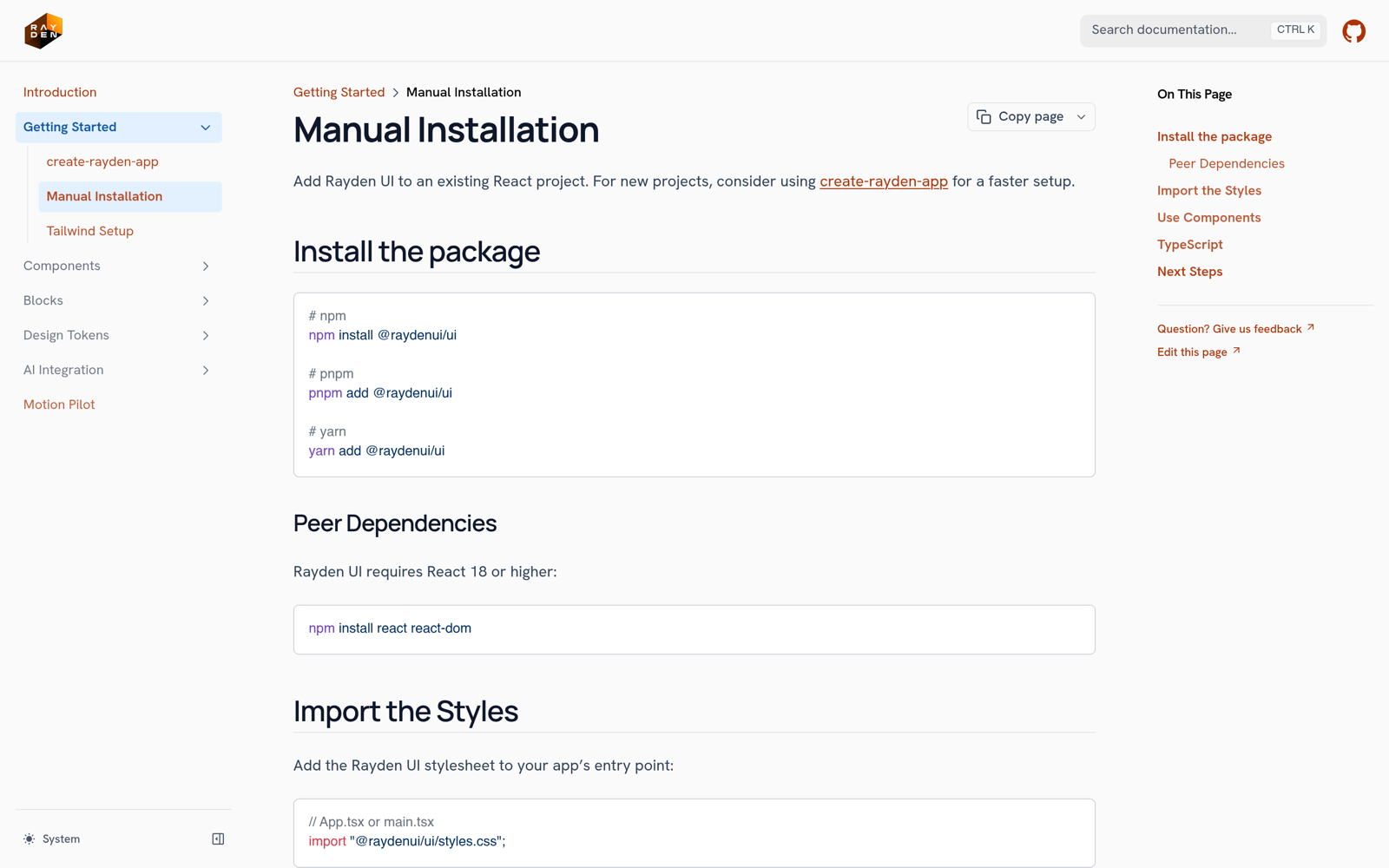
Run npm install @raydenui/ui, import @raydenui/ui/styles.css once, and render <Button variant='primary'> — or scaffold a full app with npx create-rayden-app my-app. Free for commercial use under MIT.
Typed everywhere: Every prop, variant, and slot is typed so refactors fail loudly, not silently.
Themed in one place: Swap a handful of tokens to re-skin an entire product, light or dark.
AI that knows the system: Assistants read the same manifests and recipes the docs do, so generated code matches the kit.