
Problem
Credibility buried, trust lost
Construction buyers judge a builder on trust within seconds, but most sites lead with generic imagery and bury the proof. Years of experience and completed projects never register.
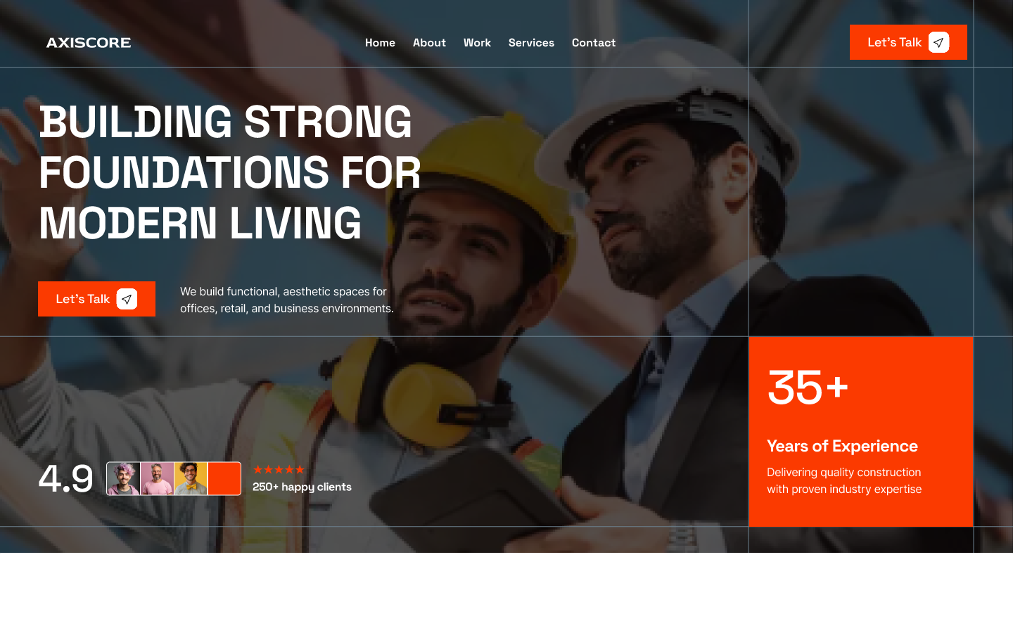
AXISCORE is a design concept for a construction and building company — a marketing site that pairs documentary jobsite photography with a high-contrast black-and-orange identity. The homepage opens on a full-bleed hero: an oversized uppercase headline over two figures in hard hats, a floating rating badge, and a bright block stating years of experience.
The tone is deliberately industrial and confident. Heavy display type, ruled grid lines and signal-orange accents carry the client's promise — functional, aesthetic spaces for offices, retail and business environments — across every section.
We build functional, aesthetic spaces for offices, retail, and business environments.
Problem
Construction buyers judge a builder on trust within seconds, but most sites lead with generic imagery and bury the proof. Years of experience and completed projects never register.
Solution
AXISCORE front-loads credibility: a full-bleed jobsite hero, a rating badge and years-of-experience block, a delivery stats band, a client logo strip and an editorial project grid — heavy display type and signal-orange accents carrying the promise of functional, aesthetic spaces.
Key decision
Construction buyers qualify a builder in seconds, so trust signals — rating, years of experience and delivery stats — sit beside the headline. The trade-off is less room for brand storytelling above the fold; we accepted that to make the first scroll do the qualifying.
A hero rating badge (concept copy: 4.9 from 250+ clients) and a years-of-experience block sit directly beside the headline, followed by a count-up stats band and an “Empowering industry leaders” client-logo strip. Trust signals are front-loaded so a first-time visitor can qualify the company within a single scroll.
Concept copy: the 4.9 rating and 250+ clients are illustrative content showing where proof belongs — not a real customer rating.
Assess
Rating, years of experience, delivery stats, and named clients sit beside the headline, so a buyer can judge experience before reading a single service description.
Verify
Project photography, categories, and years give visitors evidence of comparable work rather than generic claims.
Act
Project and proof sections lead toward a quote or contact action instead of ending in a dead end.
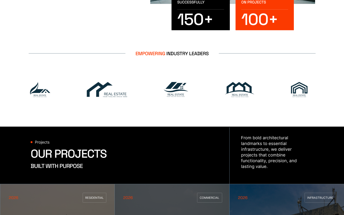
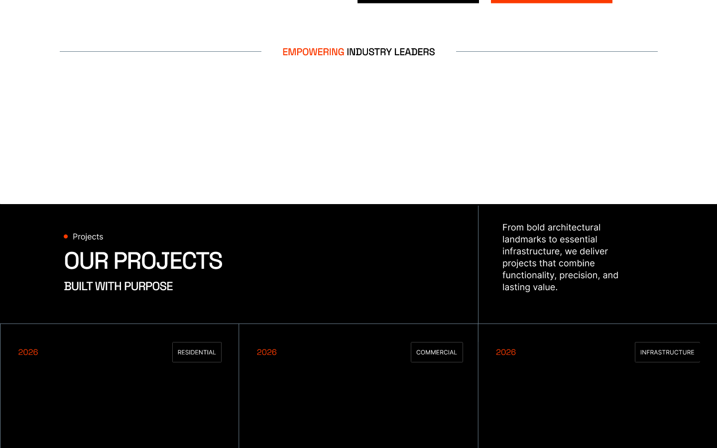
An “Our projects — built with purpose” section presents a dark, editorial grid of work: large imagery with year and category tags (Residential, Commercial, Infrastructure) that double as the filters for the portfolio. The section copy frames the range from architectural landmarks to essential infrastructure.
Because the tags are also the filters, a visitor can move from “what does this builder do?” to “have they done my kind of project?” without leaving the page.
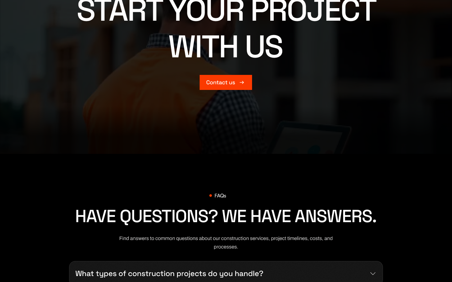
The page closes on conversion: a full-bleed “Start your project with us” call to action above an accordion of frequently asked questions covering project types, timelines, costs and process.
The enquiry journey is designed to survive a phone: the primary CTA repeats after the proof and project sections rather than living only in the footer, the form asks for project type, location, timeline, budget range, and contact details — the minimum needed to quote — and the FAQ answers cost and process questions before the form so visitors do not have to enquire to get them.
Visual rationale
Jobsite photography shows real work instead of stock lifestyle imagery, which is what construction buyers look for. Signal orange echoes hi-vis equipment and site safety, so it reads as industrial rather than decorative. Heavy uppercase type and ruled grid lines carry the confidence of an established builder, while the high contrast keeps the hierarchy legible on a phone in daylight.
What I would test: whether a first-time visitor can summarise the builder's credibility in one scroll, find a project like their own, and complete a quote request on a phone without losing the CTA. No usability findings are claimed here.
Walk the full landing page hands-on in Figma, from the jobsite hero through projects and FAQs.
Outcomes, figures, and quotes on this page are illustrative or were provided by the client and have not been independently verified.
Have a similar project in mind?
Start a project