
Problem
Everyone promises reach
Agencies all promise attention, but brands need proof they will show up consistently. Reach is easy to claim and hard to demonstrate.
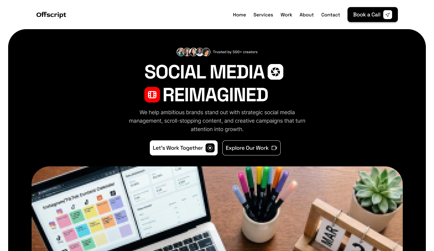
Offscript is a design concept for a social-media management agency. The landing page opens on a bold black hero — “Social media reimagined” in oversized display type, punctuated with platform glyphs and a stack of creator avatars reading “Trusted by 500+ creators”, with paired calls to action: “Let's work together” and “Explore our work”.
Below the fold the page mixes proof, service and process: a stats row, a services narrative (“We help brands show up, stand out, and stay consistent”), and a four-step engagement flow. Bright colour blocks and a friendly geometric typeface keep the brand approachable rather than corporate.
Offscript is a self-initiated design concept rather than a live client engagement. All copy, statistics, and figures shown are illustrative.
Strategic social media management, scroll-stopping content, and creative campaigns that turn attention into growth.
Problem
Agencies all promise attention, but brands need proof they will show up consistently. Reach is easy to claim and hard to demonstrate.
Solution
Offscript builds the page around evidence: creator-trusted stats, a services narrative and a four-step engagement flow that turns an abstract retainer into a visible plan — bold display type and bright colour keeping the brand approachable rather than corporate.
Key decision
Instead of leading with a portfolio, the page turns an abstract monthly service into a four-step plan and backs it with creator and delivery stats. That gives prospects something concrete to evaluate, at the cost of showing less finished work up front.
Numbers do the persuading: videos delivered, creators who trusted the studio, and average turnover — each on its own card with a playful graphic flourish. The services section follows, laying out the offer with an illustrative campaign card (Reels, TikTok, Shorts) next to the positioning statement.
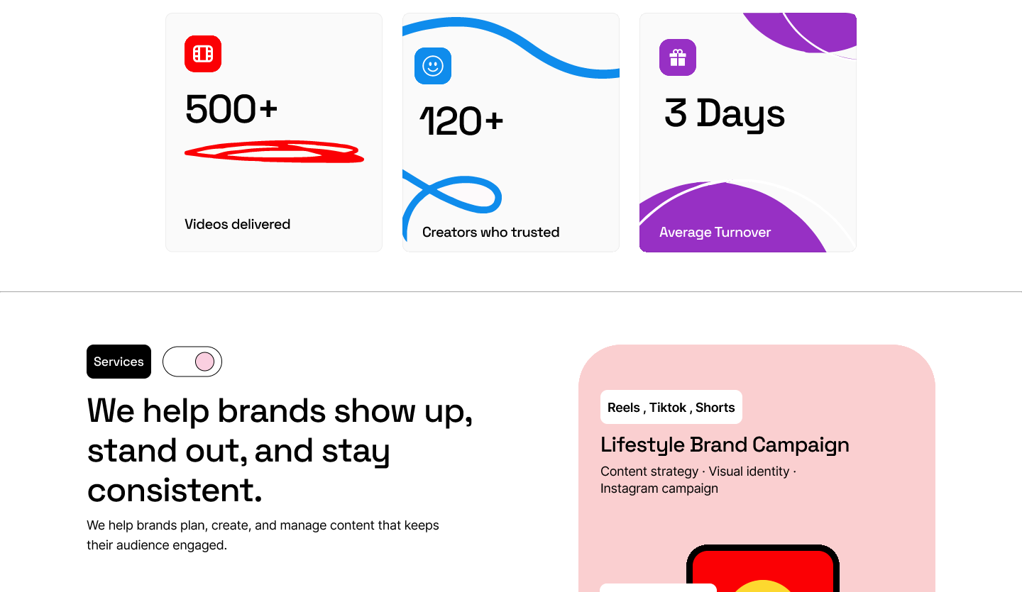
The page is structured as a decision path rather than a portfolio: a bold promise, paired calls to action, then proof, services, and a visible engagement process before the final contact ask. A prospect can either commit early (“Let's work together”) or explore the work first (“Explore our work”), and both paths return to the same contact action.
Offer
Each service says what the client gets — content, campaigns, consistency — rather than listing deliverables in agency language.
Proof
Stats and creator trust sit above services so the enquiry is backed by proof. In a live build these would be replaced with verified delivery numbers or named case studies.
Process
The four-step flow turns an abstract monthly service into a sequence a prospect can evaluate and budget for.
Key decision
Putting stats and creator trust before the service list makes the offer feel evidenced, but it delays the detail a prospect needs to judge fit. I accepted that trade-off because a social agency's biggest objection is “will you actually deliver?” — proof answers it before the services do.
What I would test: whether a visitor can explain what Offscript does and who it is for after one scroll, which CTA they choose first, whether the four-step process makes the retainer feel concrete, and where they would expect pricing. No usability findings are claimed here.
A four-step engagement flow makes an abstract service tangible — from “Tell us about your brand” and “We build the plan”, through “Review & refine”, to “Publish & evaluate”. Each step pairs a short explanation with lifestyle photography so prospects can see themselves in the process.
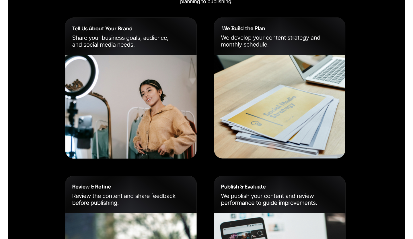
Walk the full landing page hands-on in Figma, from the hero through services and process.
Outcomes, figures, and quotes on this page are illustrative or were provided by the client and have not been independently verified.
Have a similar project in mind?
Start a project